The mission
Creating a design system for the company for making the product cohesive and consistent and make the design and develop much easier and faster.
Designing a system to rule them all!
I started to investigate by working with some of the successful design systems such as Ant design, Material Design, etc.
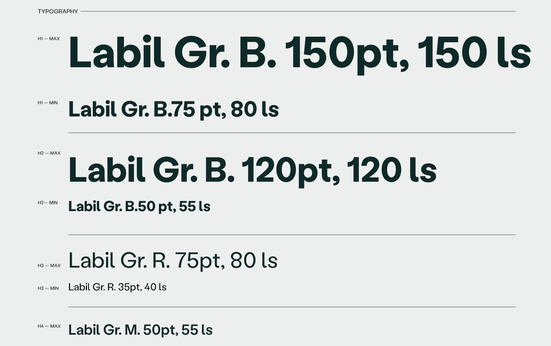
With the existing UI, I started to create a set of design guidelines and selected a primary and secondary color palette, font styles, button styles, and a set of icons and graphics. I put everything together to provide a clear set of rules for how the assets should be used.
The Great Feedback and Discovery Hunt
I discovered some issues with the accessibility of our products due to color choices, and although I tried to solve them, the results just weren't cutting it. It was clear that to have a successful business, we needed to do something that our customers could trust and feel comfortable using. So, we thought, "Why not shake things up and go for a full rebranding to make everything better?"
And that's when the fun began!
I've already made my hands dirty on the product side so I decided to focus on the product and the marketing team took the lead on creating the new brand assets and guidelines, while I worked on improving what we already had.
I refreshed the color, increased consistency, added some extra spacing, and made some other awesome changes to improve the existing product.
Best team work ever
Rebranding can be a huge undertaking, but we were confident that with the right plan in place and by involving all the necessary stakeholders, we'll be able to create a fresh new look that our customers will love.
The redesign process: from testing with users to implementation.
It was time for a new design system, but I couldn't help thinking, "Why not go for a whole new design?" While our website was beautiful, fun, and user-friendly, our product were missing that extra something. That's when I came up with the idea to give the product a makeover.
I organized a kick-off presentation to share the current pain points and the anticipated benefits of the project for the company as a whole. I highlighted the importance of having a consistent and user-friendly design across all product, and how it can positively impact our business. I also outlined the steps we would take to make sure the redesign was a success, including gathering feedback from stakeholders and testing with users.
First things first, I started by updating the colors and logo in the product. I taken the lead on researching the best options for these elements. Then, I moved on to the rest of the design changes.
As the only designer in the company, I have a lot on my plate. From designing new features and conducting research, to updating the existing design system and taking care of the developers' needs, there's always something to do.
But I'm up for the challenge! 💪🏼
I prioritized tasks and break them down into smaller, more manageable chunks to stay on track. And when I needed a little extra help, I didn’t hesitate to collaborate with other team members or get help from a professional.
This is how I planned to started doing magics
-
Researching other design systems and interfaces for components common practices and inspiration such as Ant design, Material design 3, and Tailwind.
Collaborate and seek advice from the design agency and marketing team.
Consult with developers who have experience building a design system.
-
Experimenting with various interfaces and components to define our desired style.
Regularly discussing with developers and product managers to align on goals and ensure smooth progress.
Prioritizing and refining components based on project objectives.
-
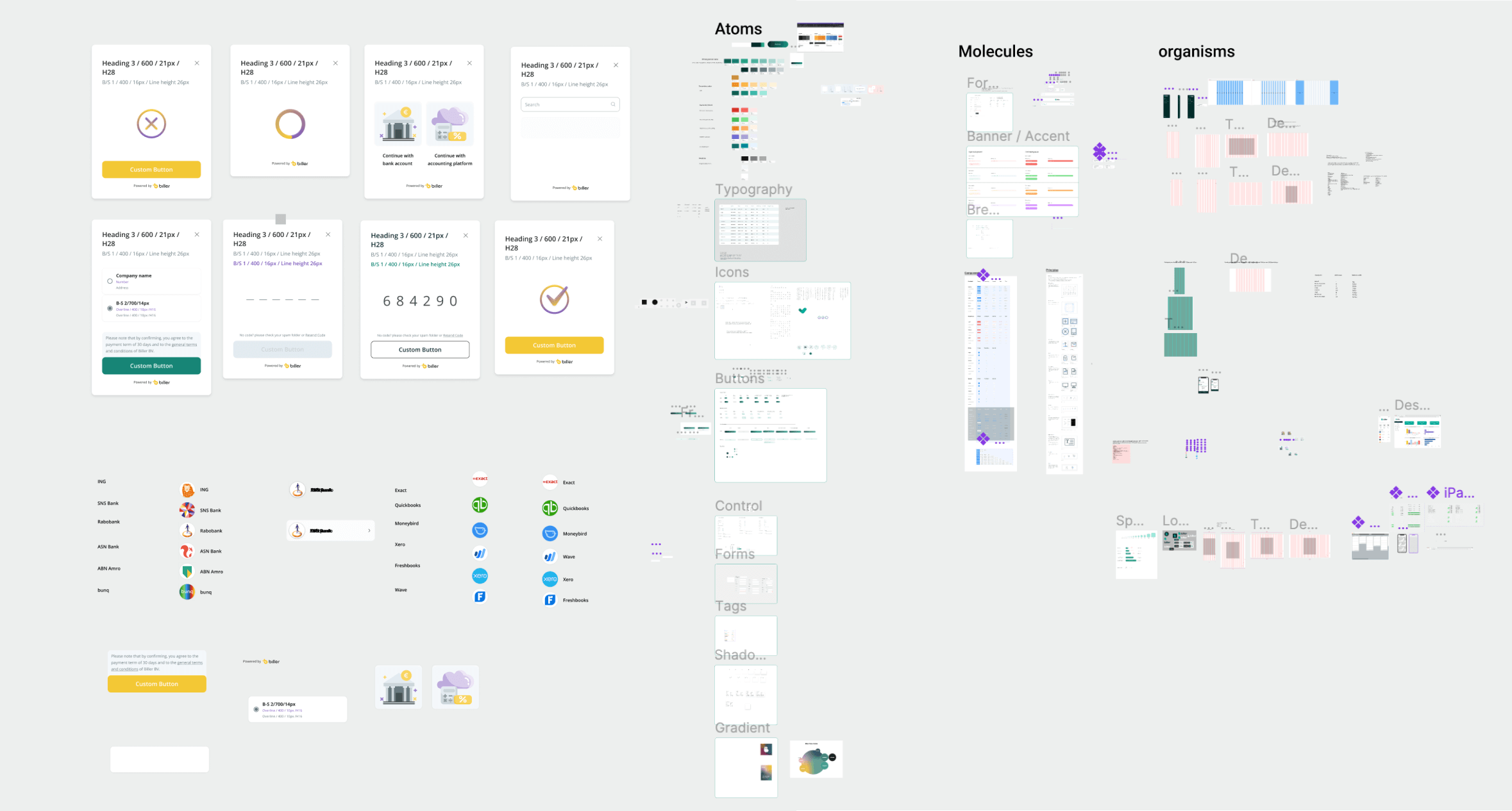
Identifying and cataloging necessary elements and components, and determining what needs to be redesigned or created from scratch.
Adding all components to a Figma library for easy access and management.
Improving existing modals and pages to align with the new design system.
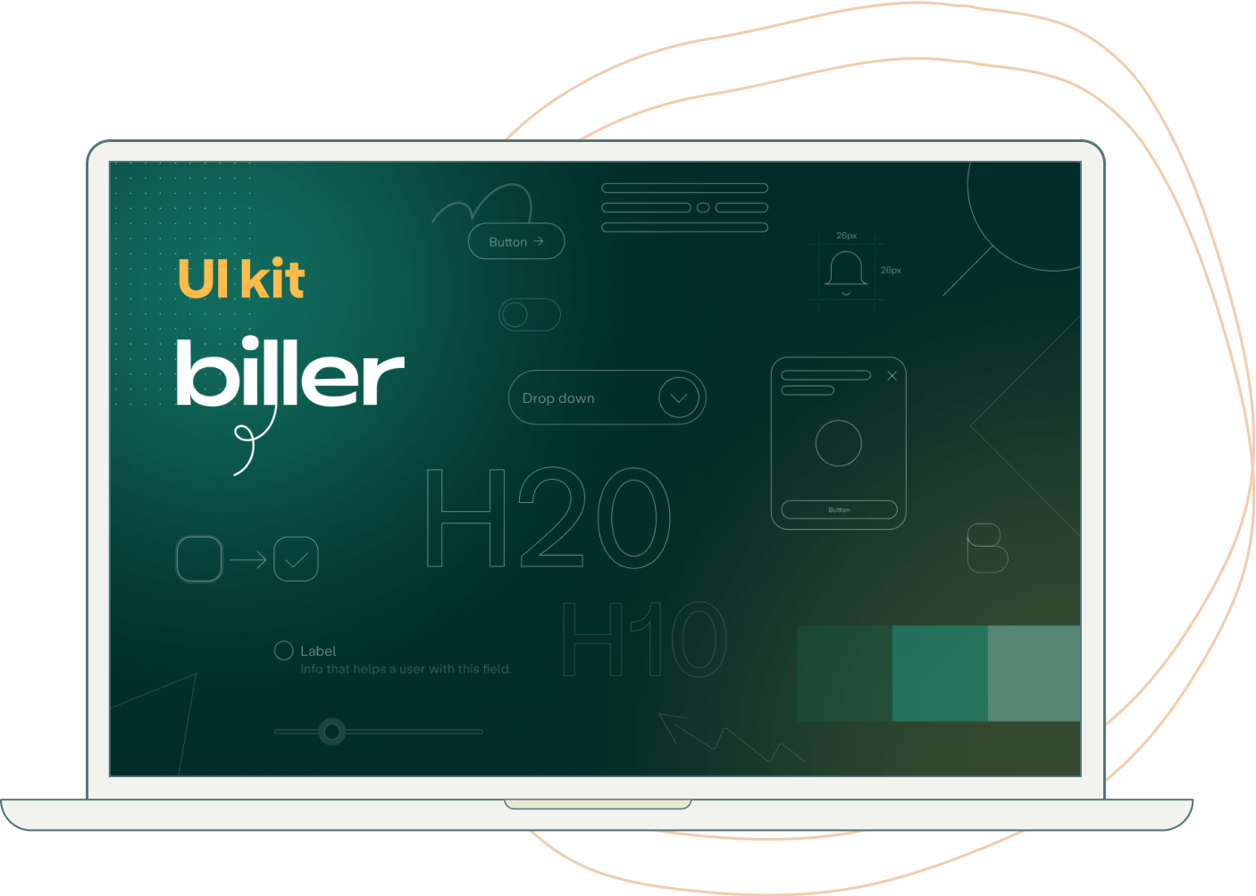
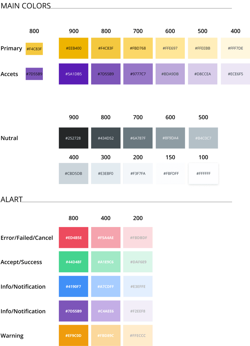
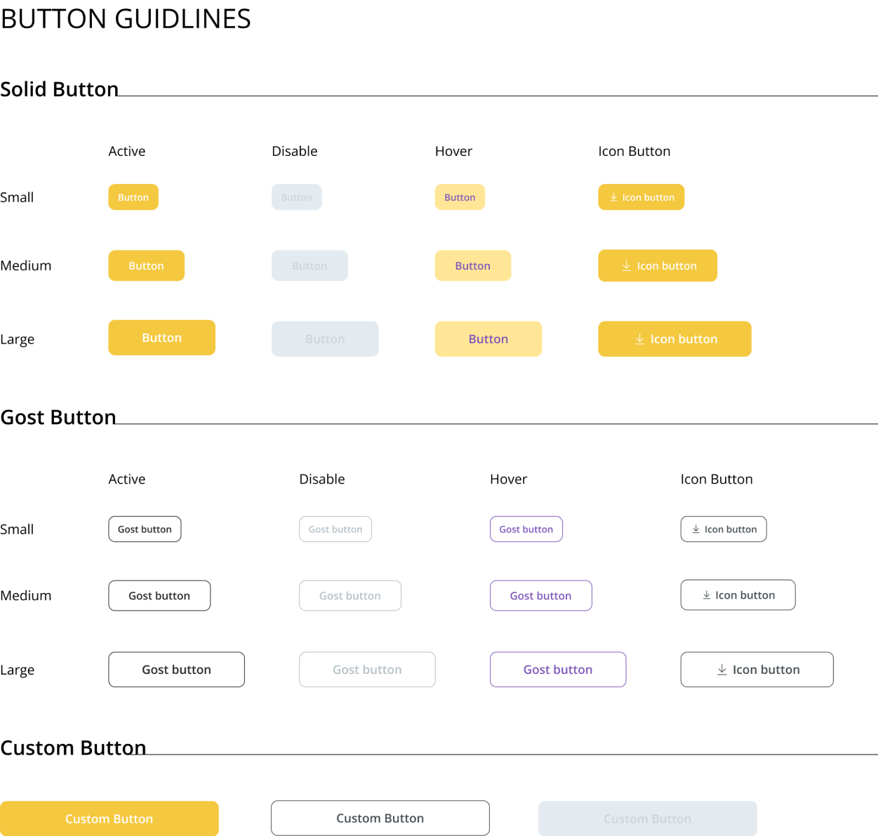
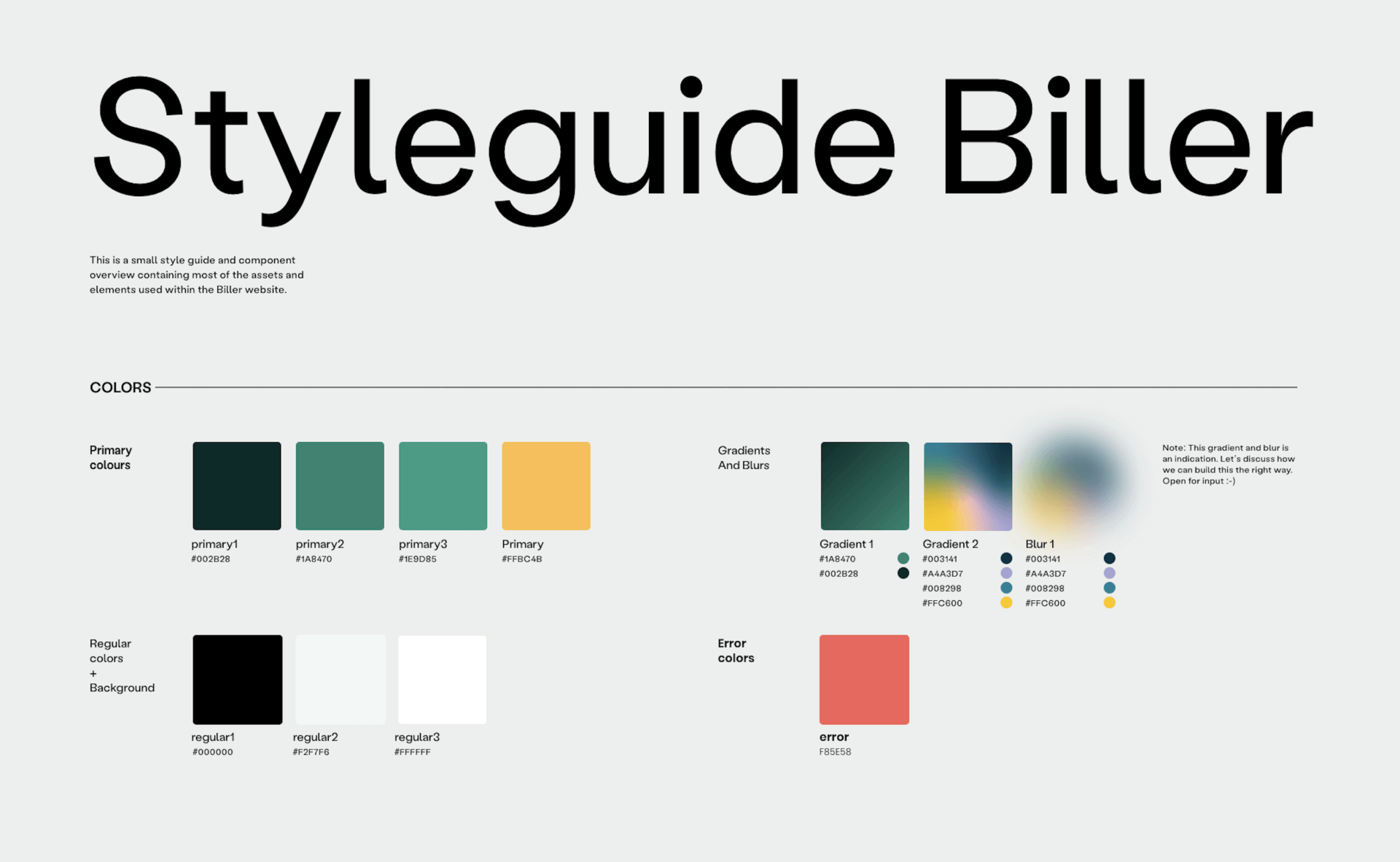
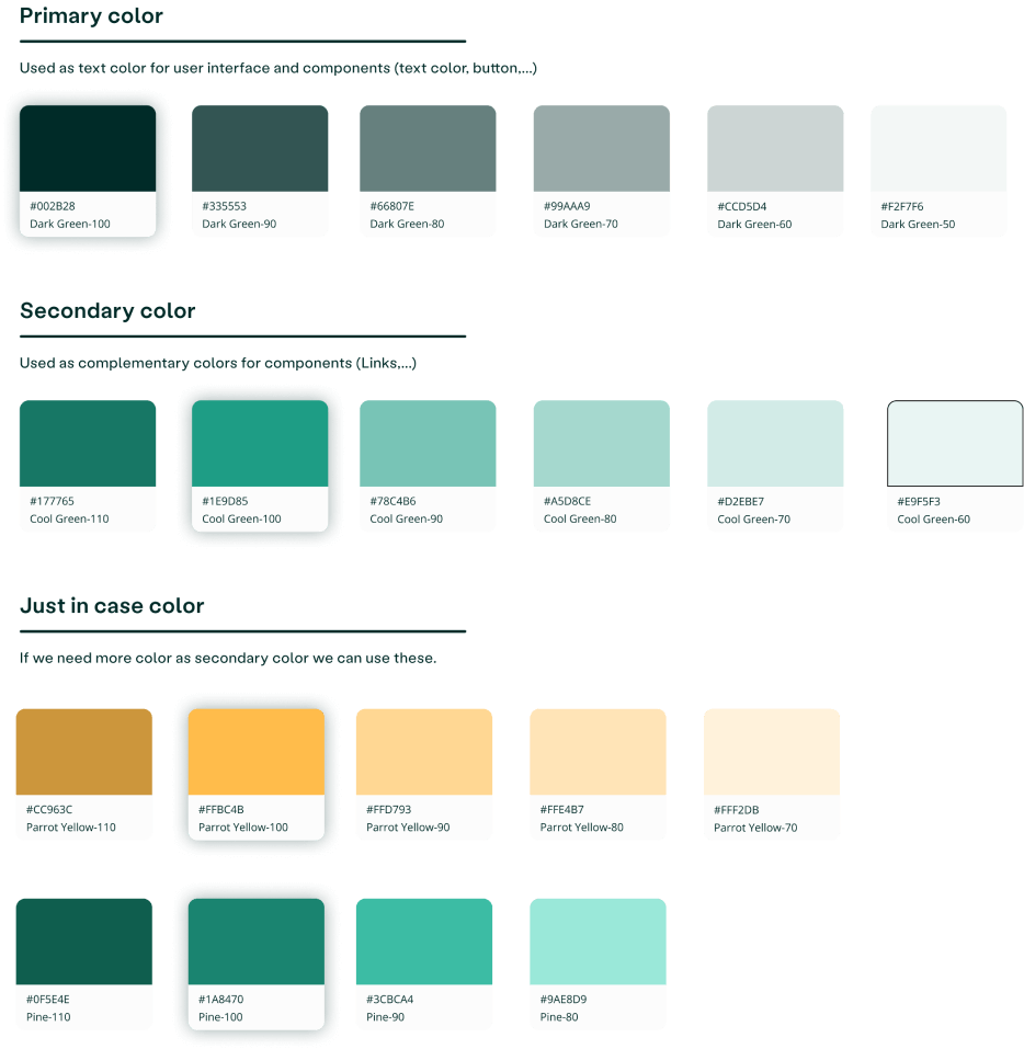
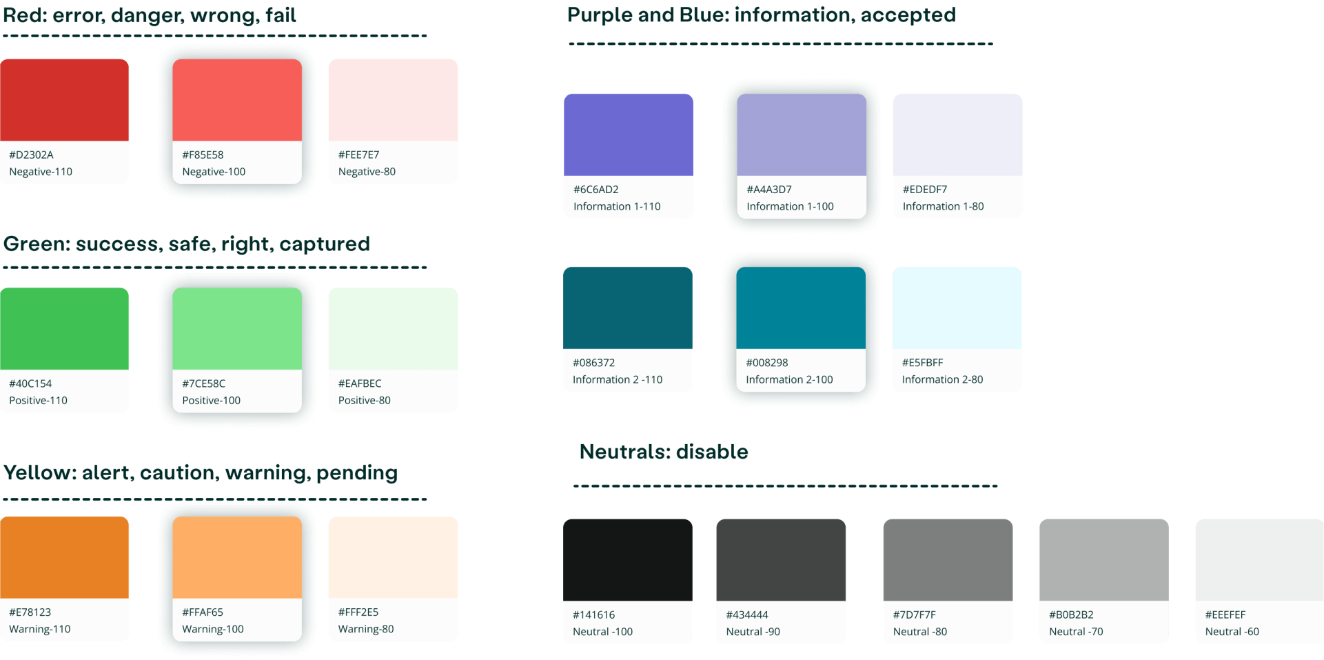
Colors
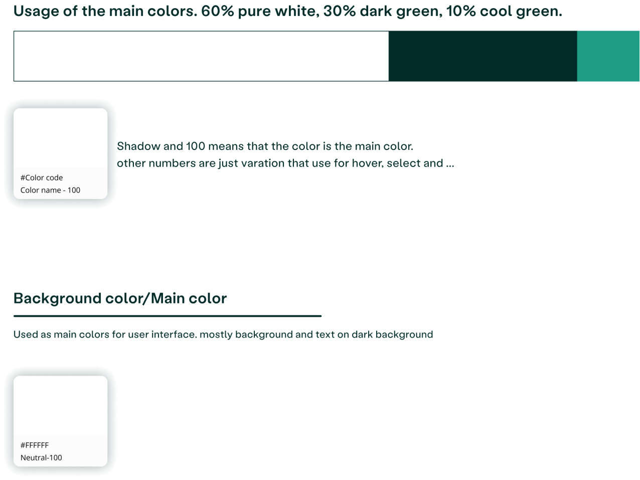
I merged different variations of components to leave only the essentials. For example, I limited the color schemes to a maximum of 6 shades for each hue and all the excessive variations were matched and merged with the decided upon schemes based on proximity. Below is the final color palette:
Icons
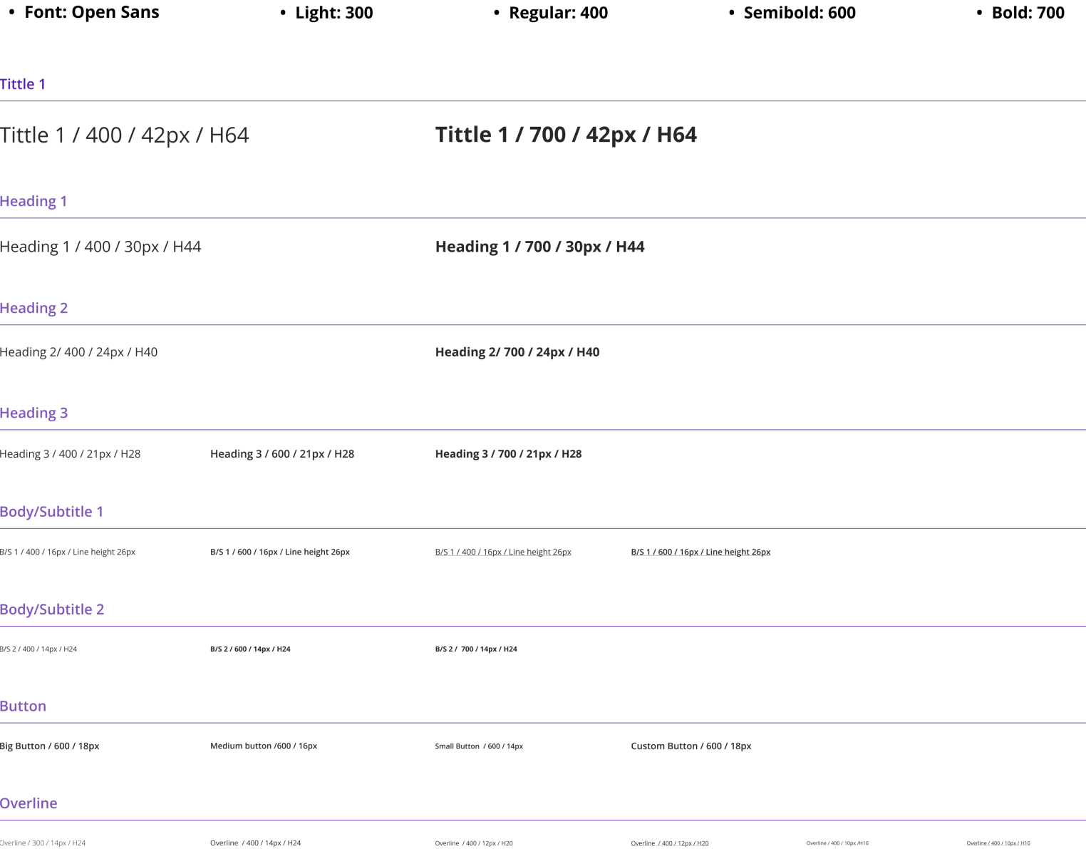
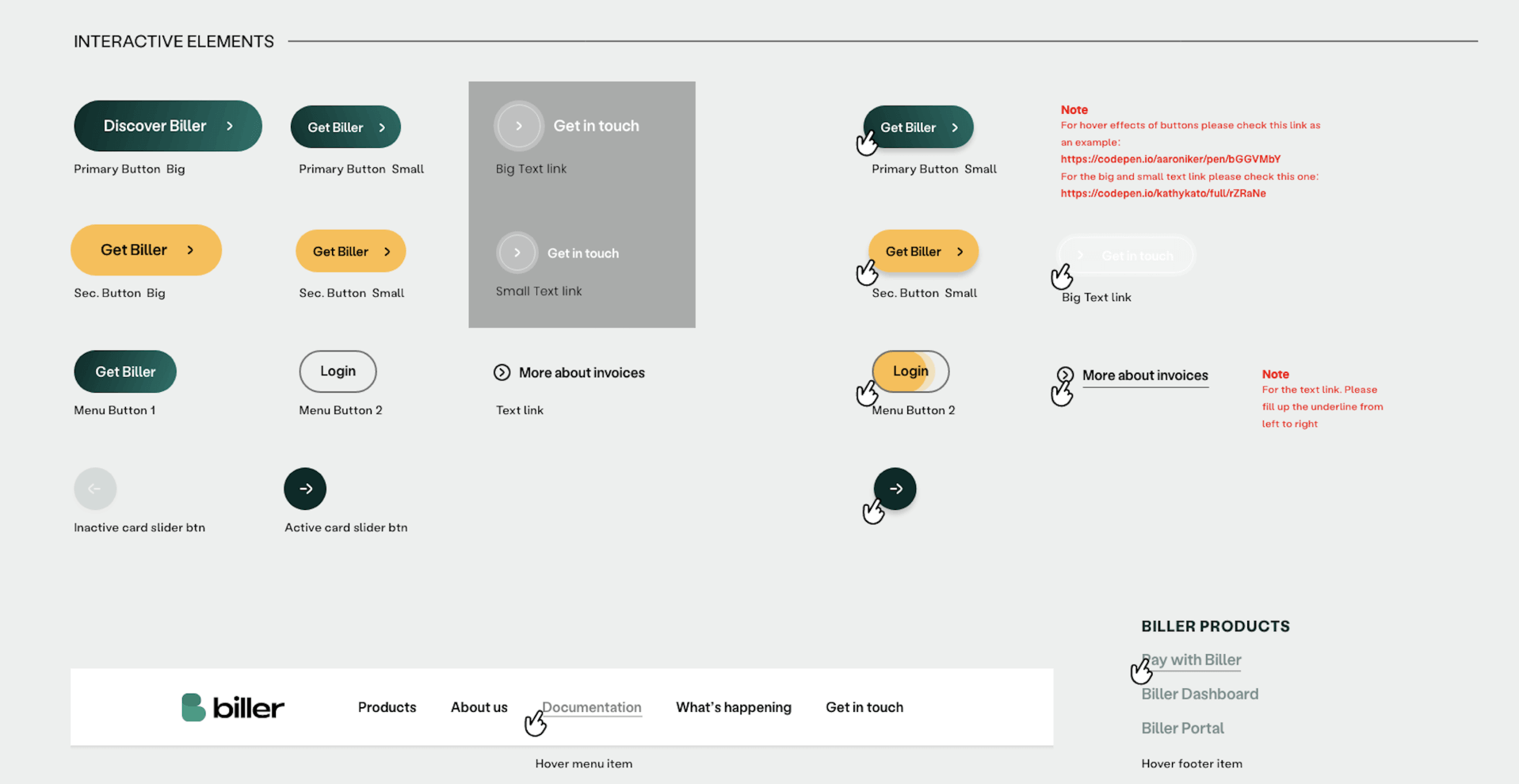
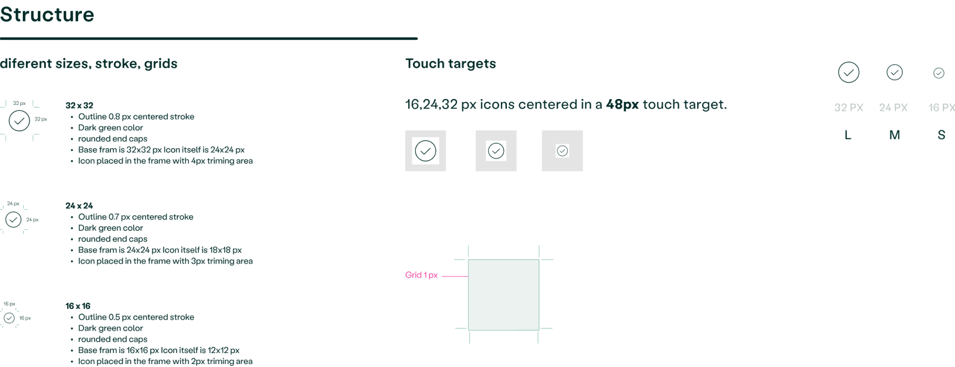
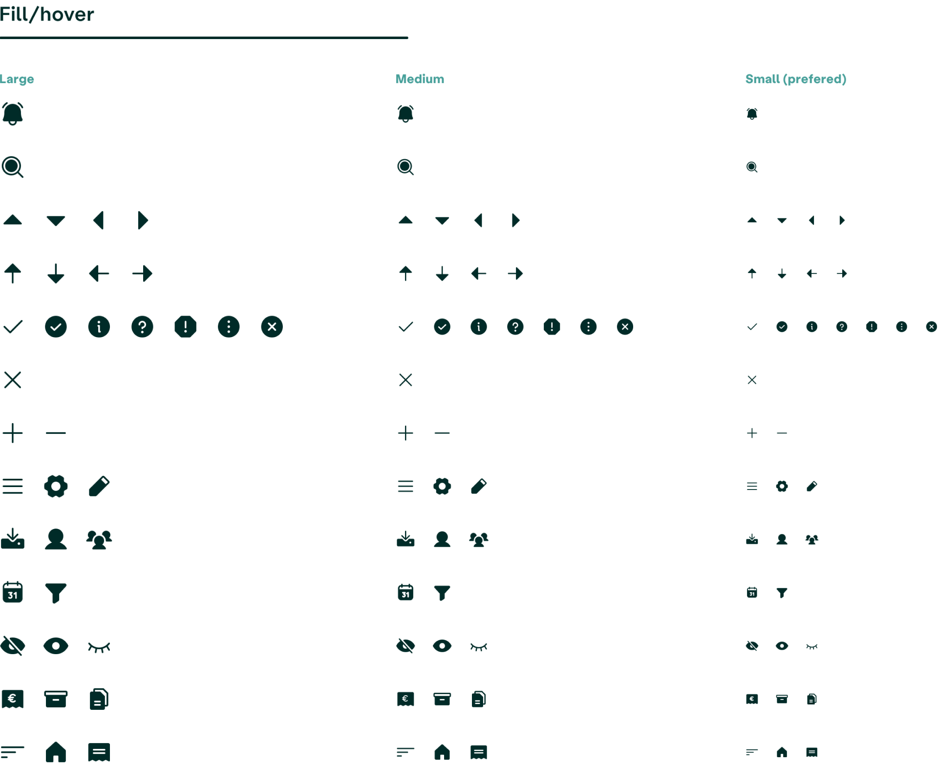
Collaborating with our talented graphic designer, we determined the perfect icon style for the product. We settled on a combination of flat and rounded, with a focus on making the design user-friendly and soft. To ensure consistency, I established a set of design rules for size, color, and spacing.
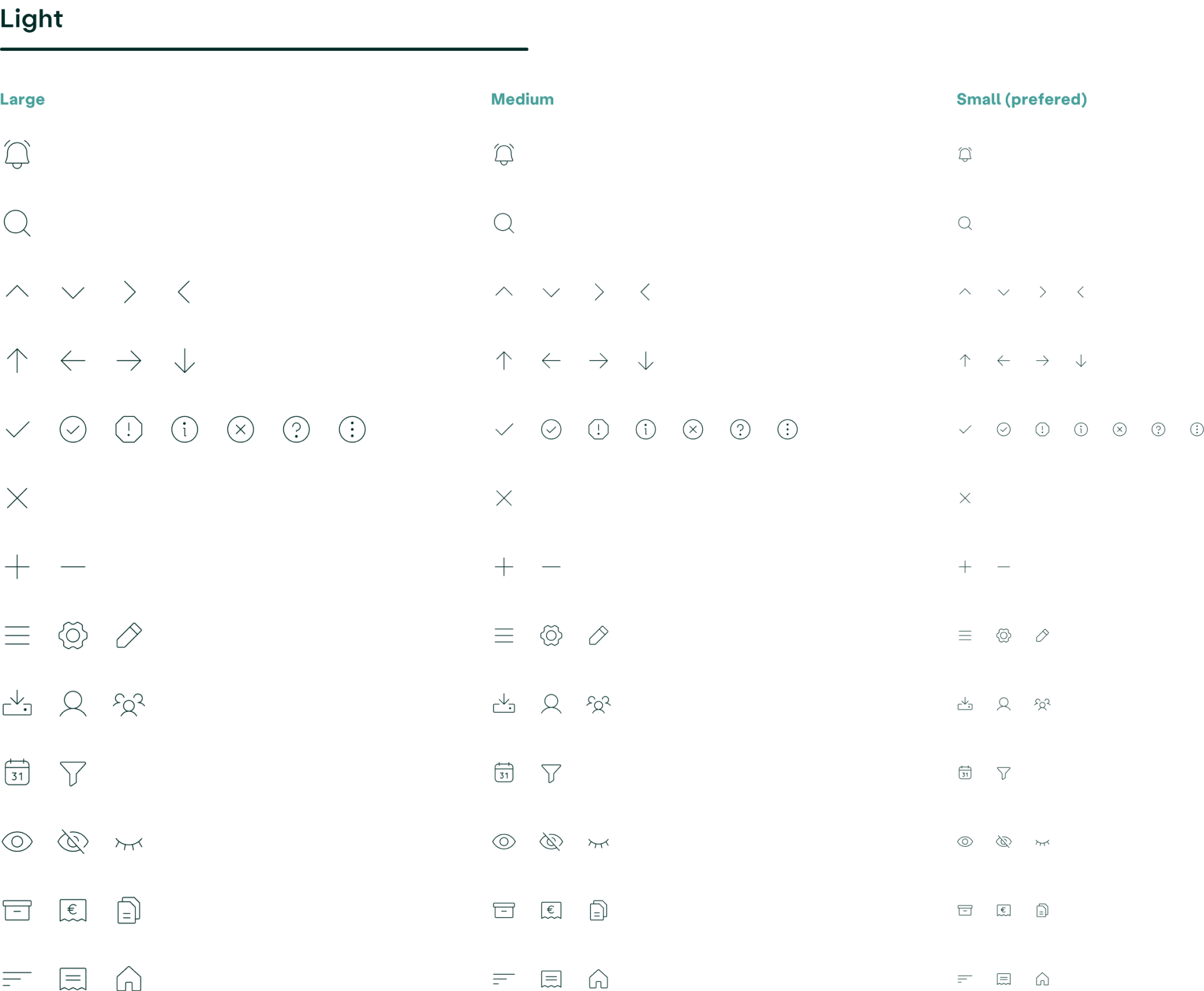
I decided to use thin outline icons for the regular state and filled icons for the hover state. And instead of using massive icon set, I made sure to have every icon that we actually needed in the product. This not only saved time, but also helped me stay organized and efficient.
Principles I followed
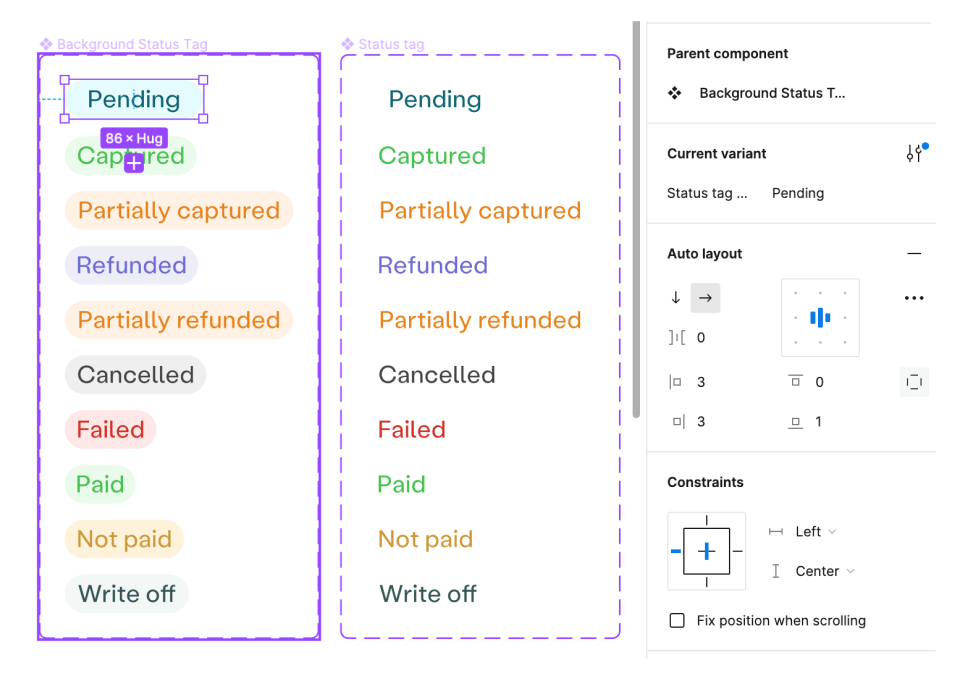
- I tried to make our components responsive with the auto-layout Figma feature, so we could reuse those components when designing for different devices or layouts.
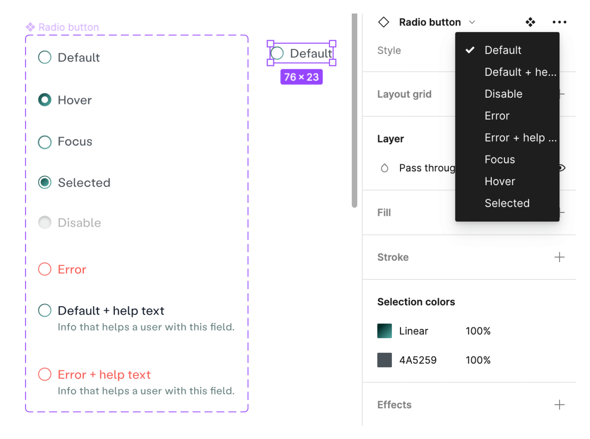
- I designed to cover all scenarios, or “states” in the system: hover, focus, filled out, error, and disabled state.
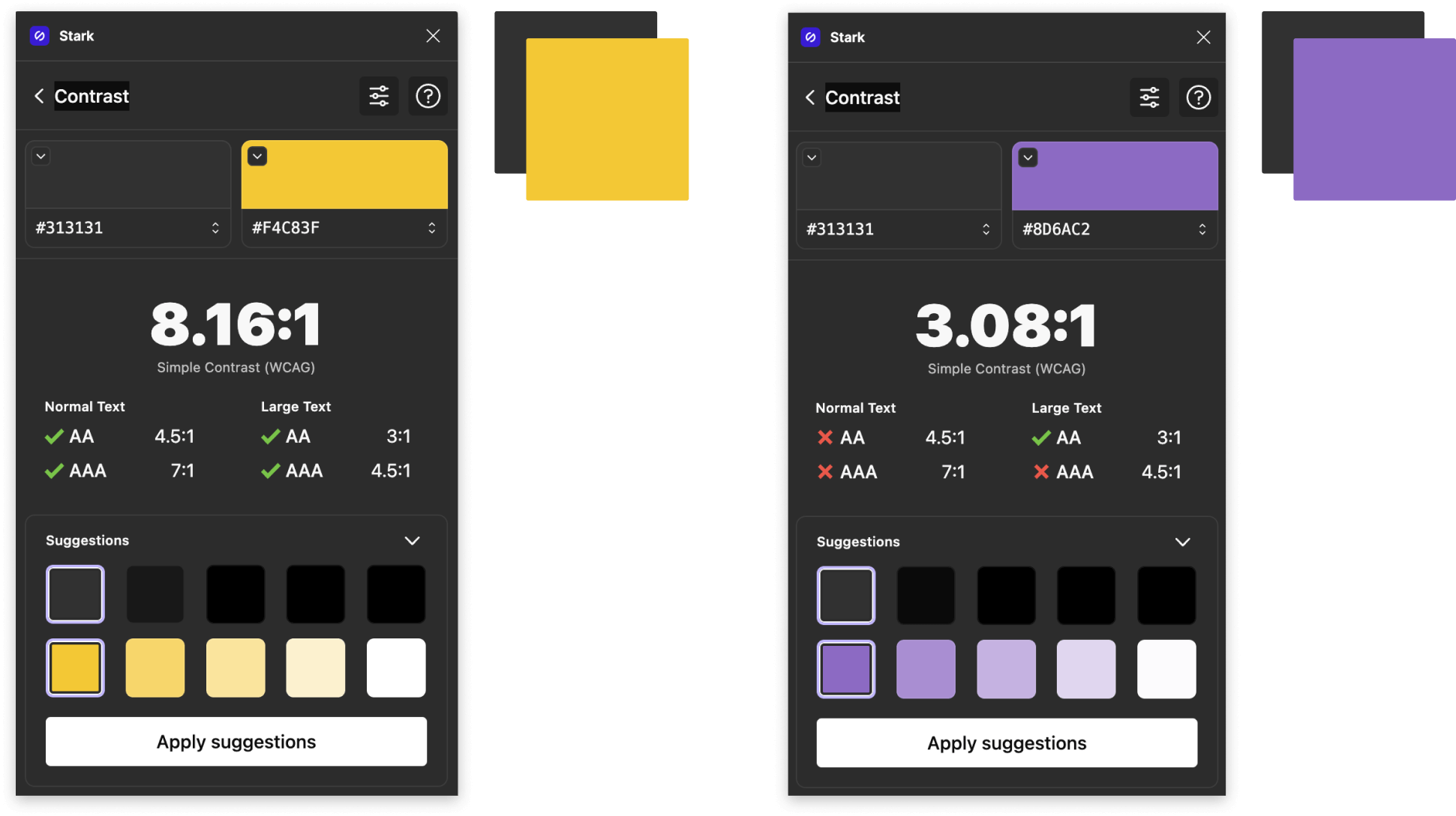
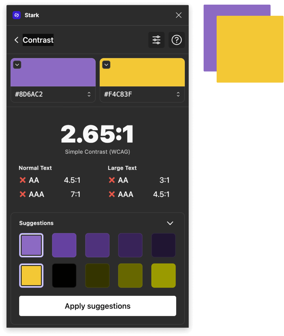
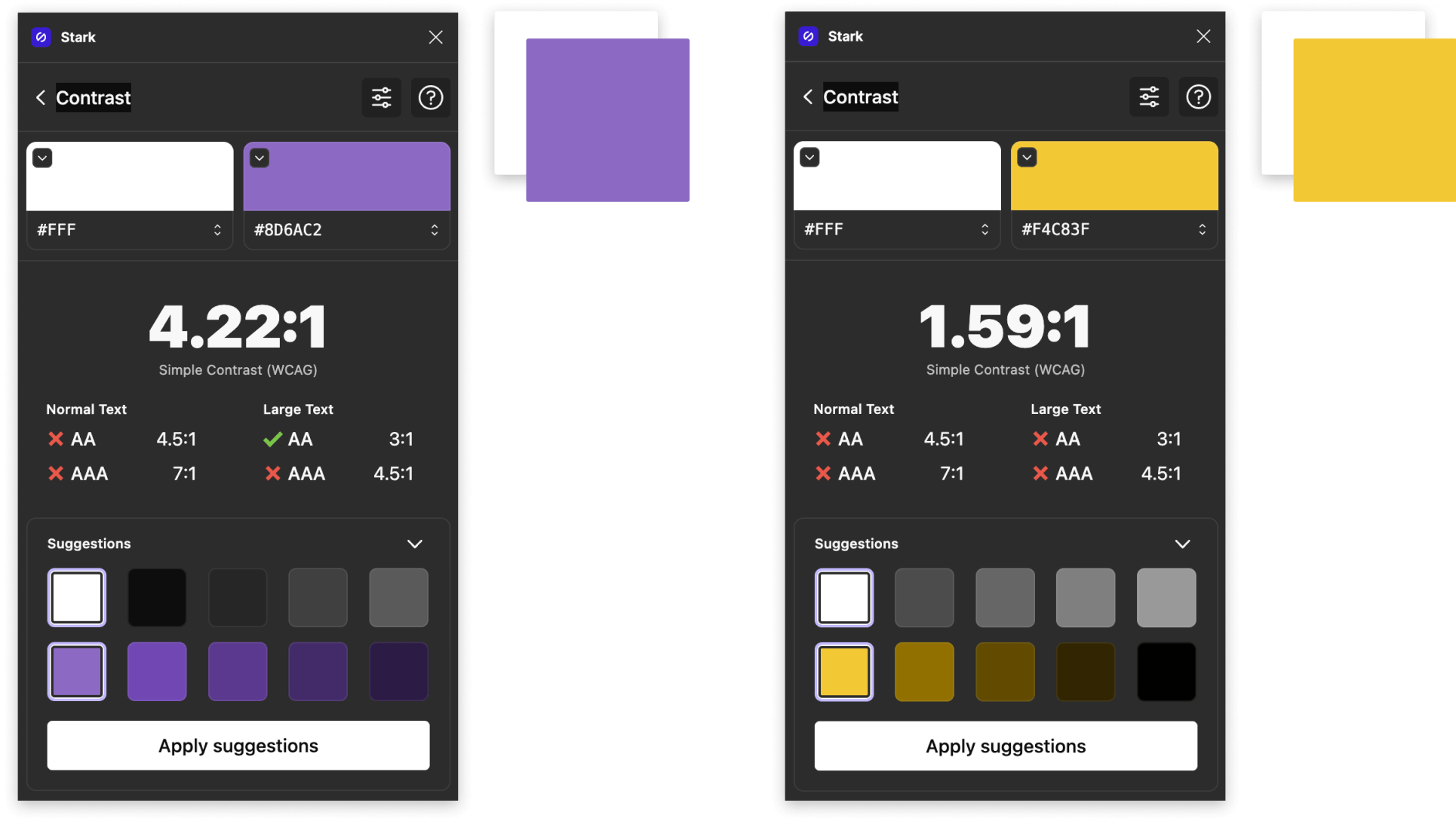
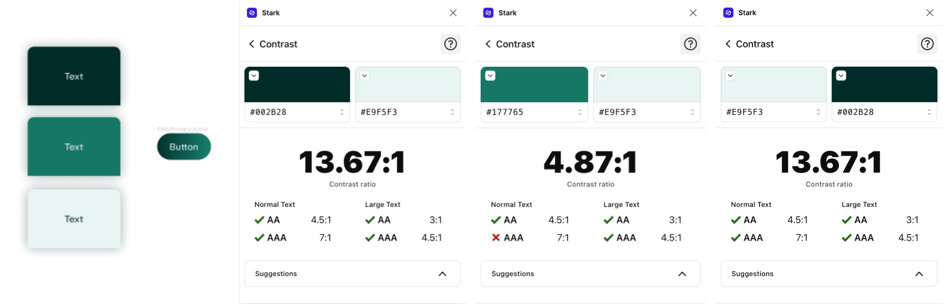
- Each component I designed with accessibility in mind. I strived to comply with WCAG AA accessibility standards. Below is an example of intentional choice of color on the primary color to achieve sufficient text contrast (checked via Stark Figma plugin) so that users with low vision can see and use the product.
The process to implement the rebranding and redesign
The first image shows the initial design I received, the second shows the improvements and added rebranding elements, and the final image shows the result of the efforts – the polished, final look of the new design.
Design validation: a 30% reduction in customer service tickets
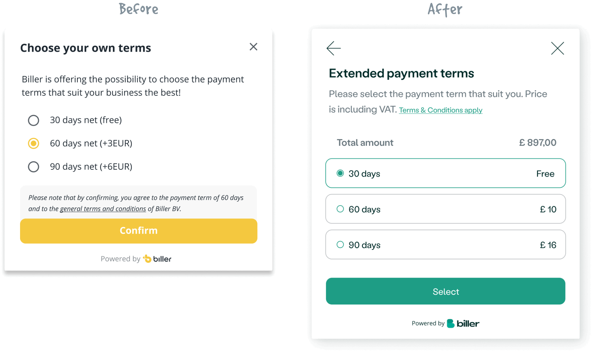
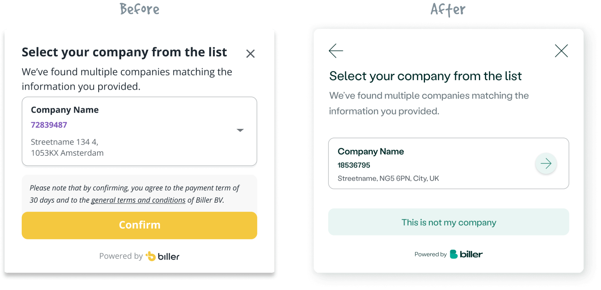
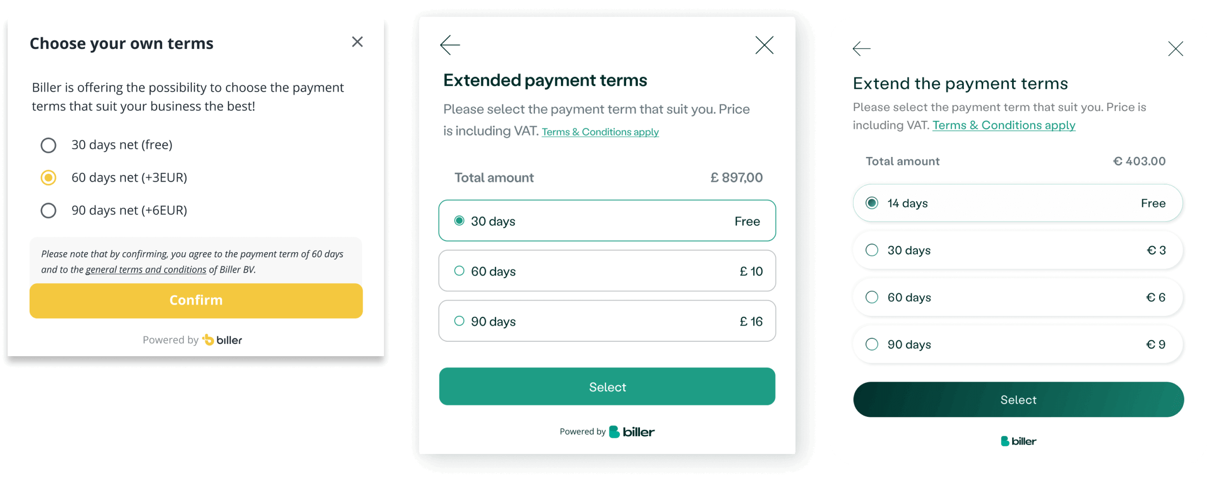
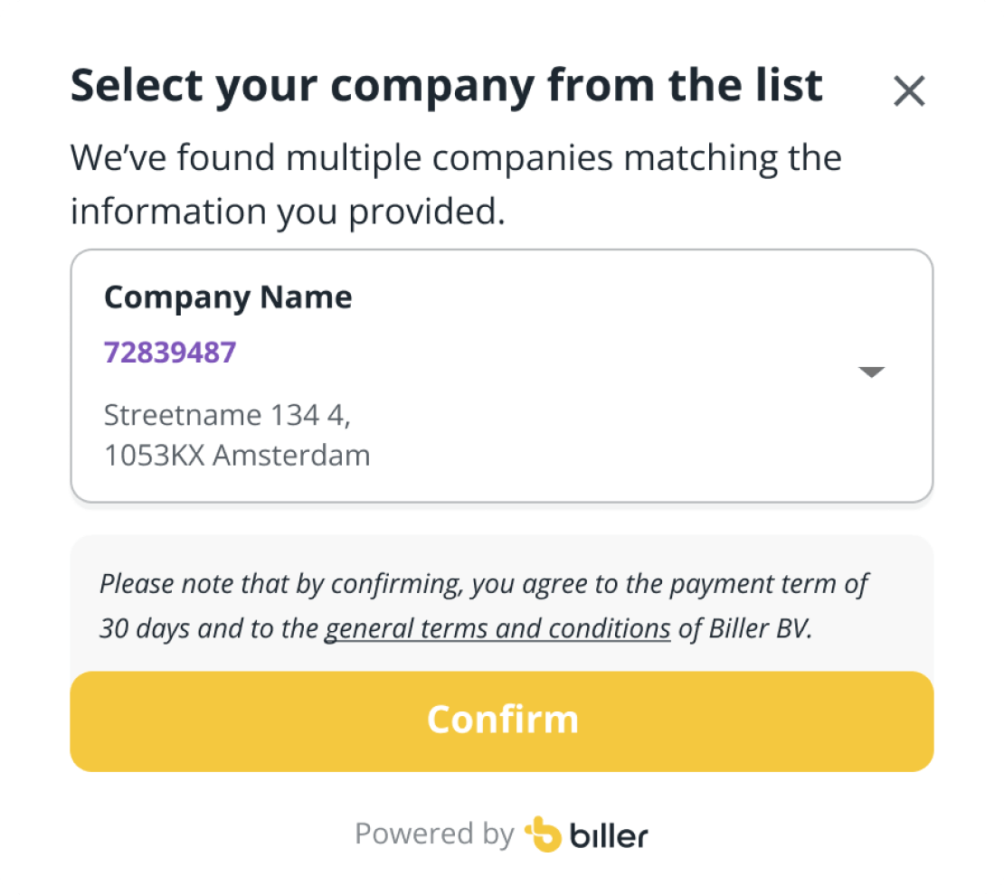
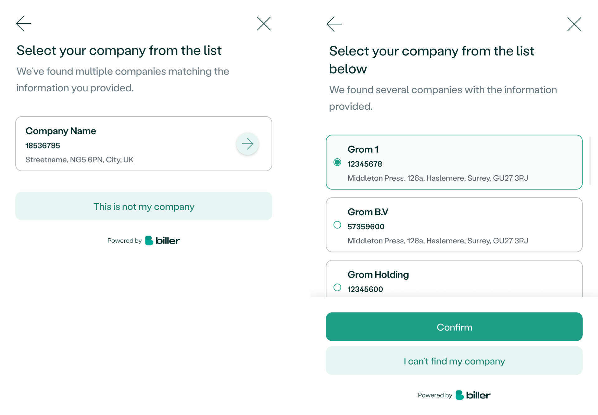
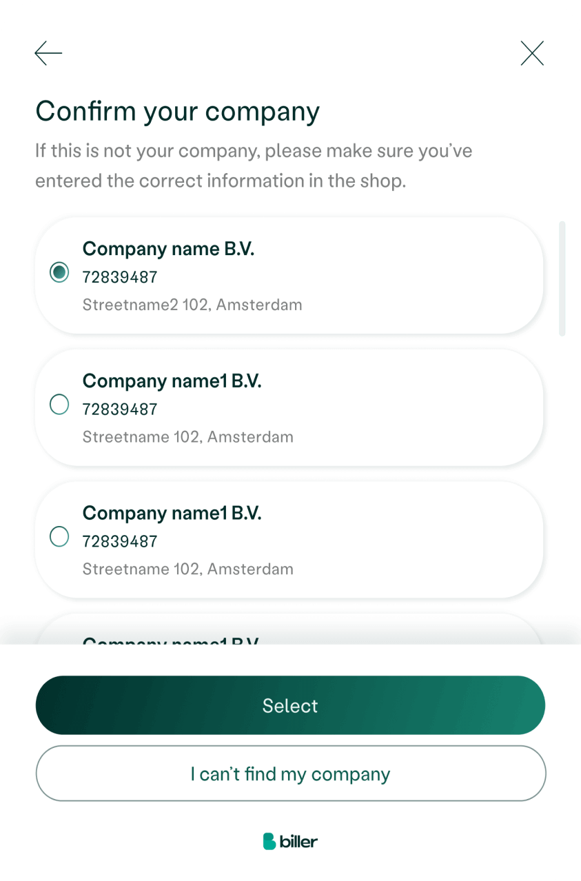
I made some improvements to the modal that shows users their company options.
Previously, the search engine could find multiple companies, but there was no list for the user to see, and they had to click on a confusing button to see the list in another modal.
To fix this, I first made a quick change by changing the button to an arrow with a shadow and a different color to grab the user's attention, which decreased complaints by 30%.
After conducting user research, I further improved the modal by making it an actual list with radio buttons, so the user could easily see and select their company.
As a result, there were almost no complaints about the list. 🚀
The future will be awesome
The design system is a work in progress.
Currently, the developers are implementing it from Figma to Storybook.
Next, we'll verify that all components and their usage work seamlessly together, and then work on usability testing to see if our users love the product as much we do.
Focus on documenting and adding the construction is the next step i this journey.
Our ultimate goal is to create a cohesive and functional design system that helps our team build and maintain a consistent user experience.