The mission
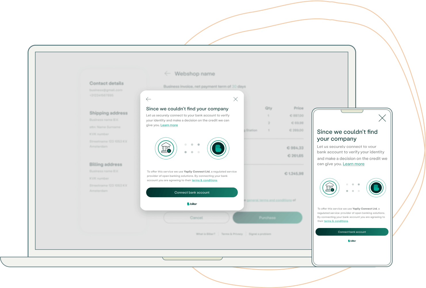
Creating Open Banking to underwrite sole traders in the UK to increase our acceptance rate and provide a robust solution that gives us greater coverage of the sole traders segment in the UK.
Our goal was to create an efficient, effective, and user-friendly process for making payments. Designing a process to be straightforward and hassle-free.
How we used Open Banking?
Open APIs enable buyers to share their banking data with Biller during the checkout process on a web-shop. This allows for a more convenient and secure payment experience for both parties, as the APIs provide a standardized and secure method for accessing and transferring financial information.
Collaborative Problem-Solving
In order to develop a comprehensive and effective solution to a given project, I worked closely with the operation, product, analytics, and legal teams to thoroughly explore all possibilities and ask any necessary questions to ensure clarity.
In addition, we created a detailed document outlining the project, problem, solution, measurement plan, and target audience. By involving all relevant teams and taking the time to ask questions and seek understanding, we were able to arrive at a solution that is well-informed and likely to succeed.

Ideation to Wireframing
The project was a challenge to complete as it required a variety of tasks such as researching, finding solutions, designing, testing, and so on. It couldn't be done by just one person, so I collaborated closely with our product manager who had prior experience with similar projects. Together, we broke the task down into smaller parts and started researching ideas and solutions to achieve our goal.
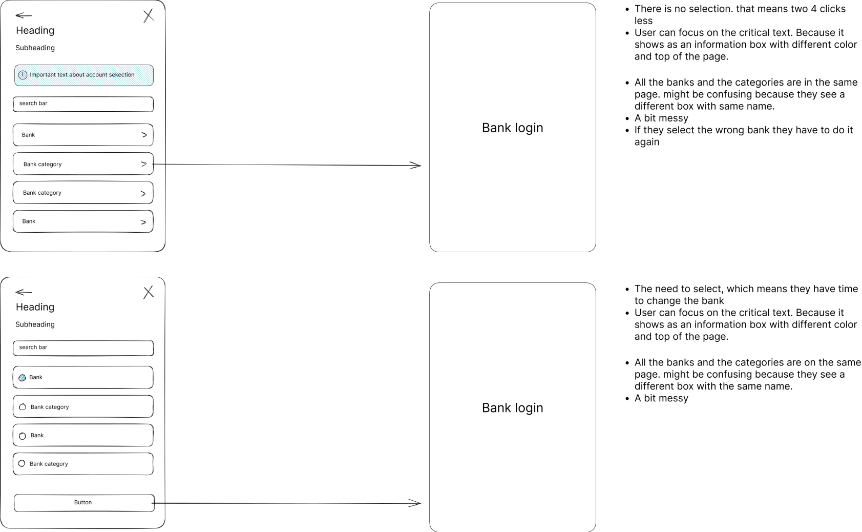
This included analyzing similar products and solutions in the market, as well as gathering feedback from stakeholders and users. Once we had a clear understanding of the requirements, I created wireframes to envision the layout and user experience of the product. By using the wireframes, we were able to improve or modify the design before moving on to development. This helped us to better understand and share our ideas with other teams.
Overall, the research and wireframing phase was critical in helping us to create a well-designed and user-friendly solution that met the needs of our stakeholders and users.
Improving Design through Internal Testing
The project faced some challenges during the process. Legal issues and constant changes requested by stakeholders caused us to restarts multiple times. In addition, due to financial constraints, we faced limitations in terms of testing and external research support during the development of the project.
To handle these challenges, I came up with an internal testing method. While internal testing may not have been the ideal scenario, but I chose people from different departments to test based on their level of knowledge of the Open Banking, who either didn't know much about Open Banking or talked to customers more often.
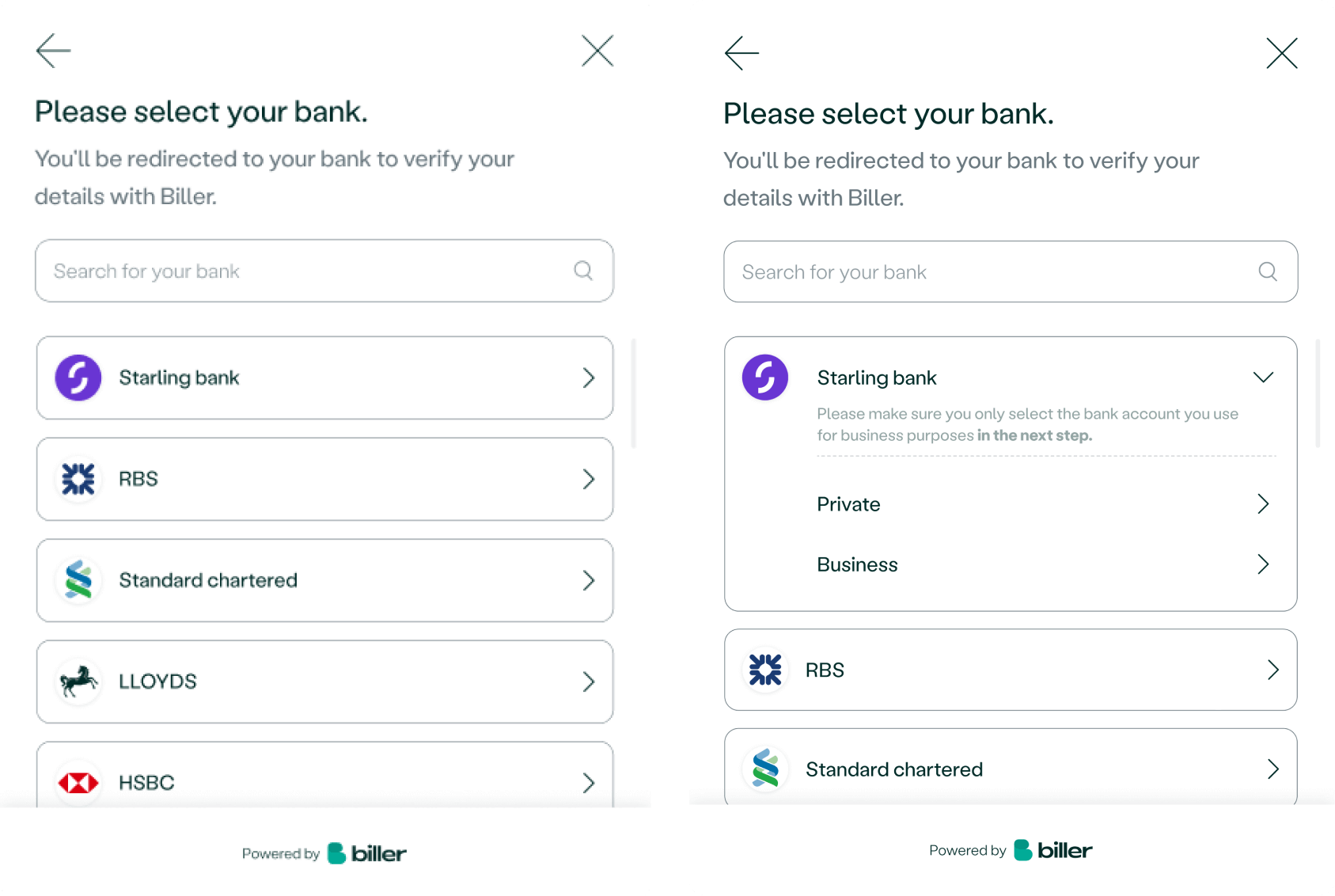
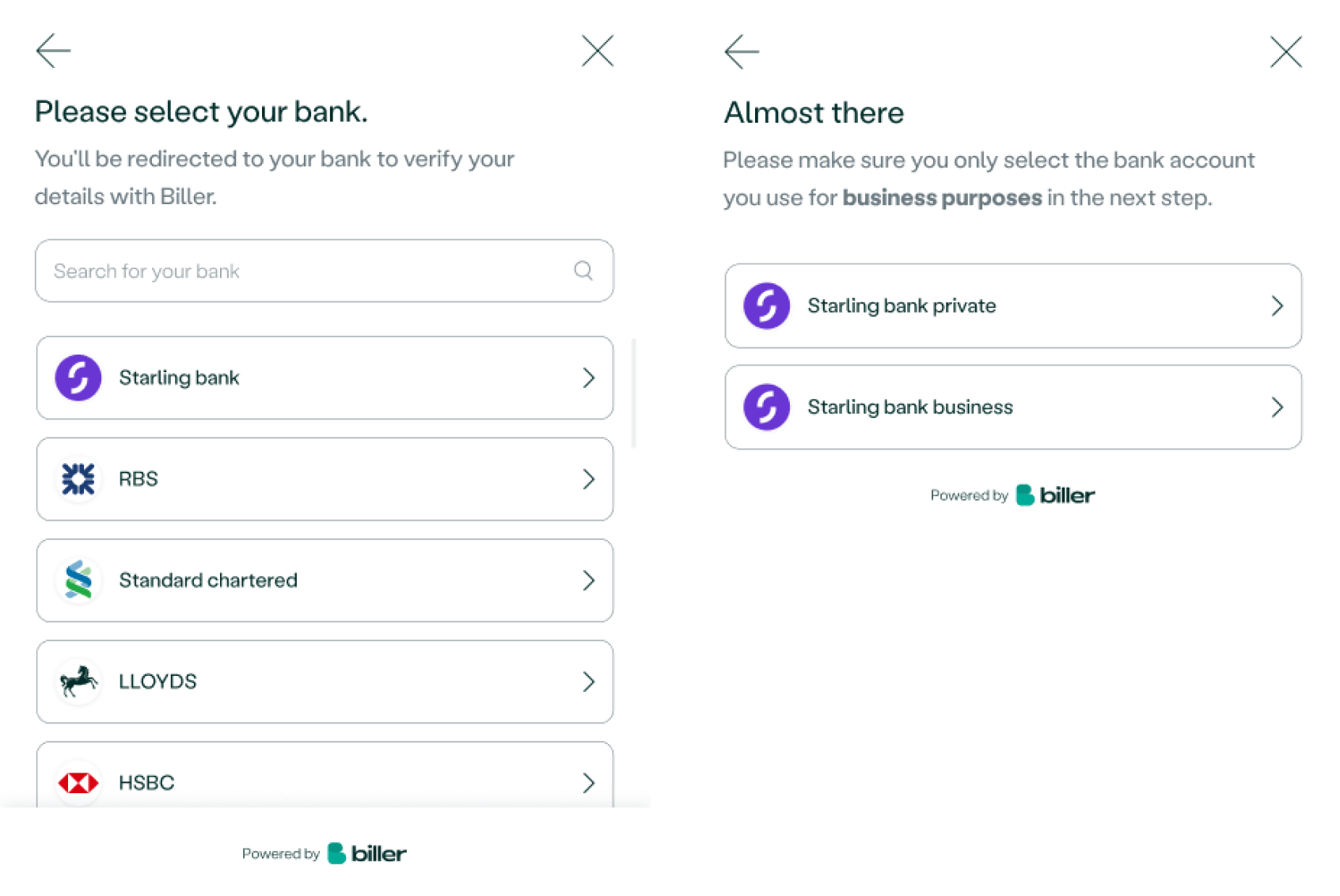
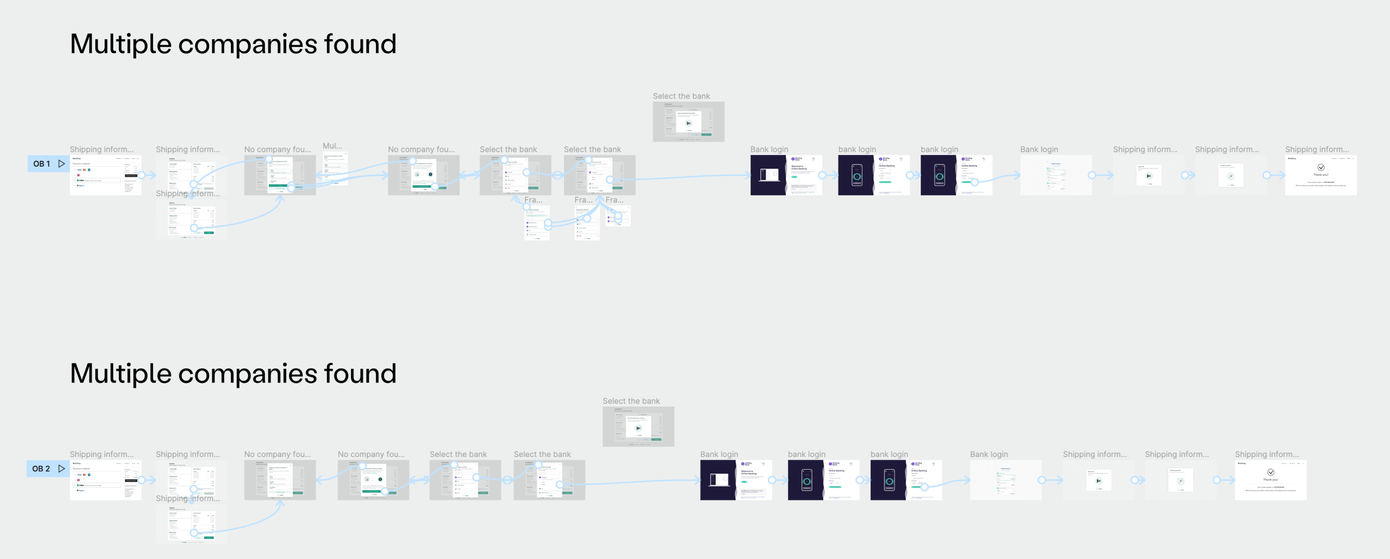
Before the testing began, the wireframes were identified as difficult to understand and work with in a team meeting. As a result, I created mockups to make the designs more realistic and then created prototypes that could be clicked on.
The prototypes were based on the wireframes I created during the research and brainstorming phase, and it allowed us to analyze various design ideas and concepts more thoroughly.
The prototypes were based on the wireframes I created during the research and brainstorming phase, and it allowed us to analyze various design ideas and concepts more thoroughly.
Evaluating Design through Testing
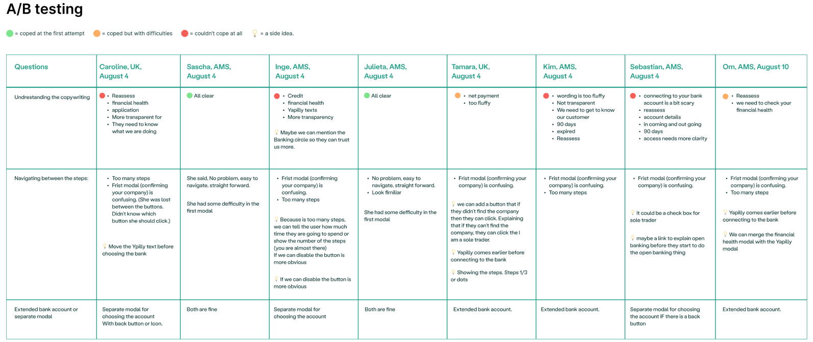
I wanted to make sure that we were doing testing in the right way as it was my first time, so I investigate about testing methods like A/B testing, User testing, Surveys, etc. I took a short course in Interaction Design and read articles in Nielsen Norman Group and I decided to go for A/B testing. After that, I created a Google Doc that would help me organize the testing process. In the doc, I split it into three main parts: pre-testing, testing and post-testing.
In the pre-testing section, I included a short explanation of what Open Banking is, this was necessary as some of the users may not be familiar with the concept. I also included some questions about the users' backgrounds, this would help me understand the user's level of expertise with the topic.
The testing section includes questions that were focused on user behavior and how the interface of the product is being used. These questions were designed to test how easy or hard is for the user to accomplish certain tasks.
The post-testing section was composed of questions that were designed to get feedback from the user about their experience and how they felt while performing the task. This section also includes some questions about the process, the aim is to understand if the testing environment was appropriate, if the instructions were clear, and so on.
To gather the results at the end of the usability testing, I reviewed the videos that I recorded during the testing sessions with the users' permission. I used the list of questions that I prepared beforehand to make notes and observations about the user's behavior and feedback. After that, I organized the information in a table to make it easier to understand, and shared it with the team so that we could all analyze the results together and make decisions based on the feedback.
Overall, this process helped me create a detailed and complete usability testing plan that covers all aspects of the user's experience and it ensures that all feedback is captured.
This step was crucial as it helped us confirm the design and ensure that it met the needs of our stakeholders and users before proceeding to the next step of development.

Designing for Success: User-Company Balance in final design
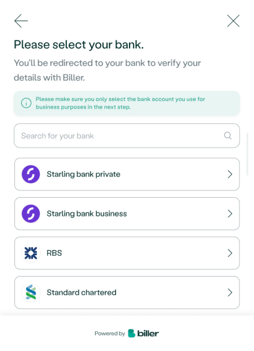
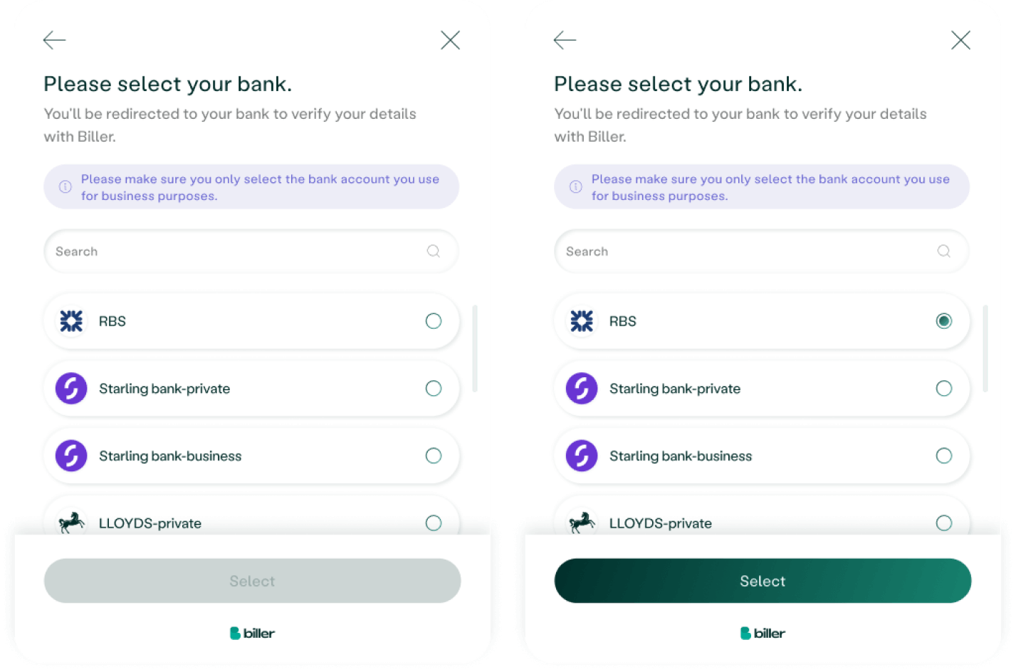
After taking into account the needs of both users and the company, as well as feedback and test results, I developed the final design that incorporates many of the key features. The design is clear and easy for users to navigate, the most important information is prominently displayed at the top to grab their attention, and a 'select' button allows users to confirm their choices with confidence.
What I learned in this project
Reflecting on the process of completing this task, I realized that there's always room for improvement. But, the journey was worth it. I picked up some valuable skills, such as collaboration, usability testing, and UX research and UX design.
One of the best things about UX process is that it's a process that allows for constant improvement. I had the great opportunity to continually refine and improve my work, whether it was through my own discoveries or through feedback from my team.
Overall, I'm thrilled to have been a part of this project and I'm excited to apply everything I've learned to future projects!
